
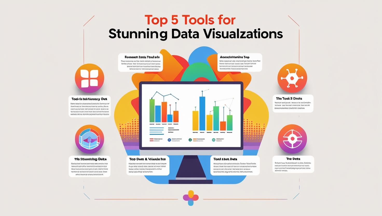
Top 5 Tools for Stunning Data Visualizations
Discover the top 5 tools for creating stunning data visualizations, from Excel to Tableau. Ideal for analysts, professionals, and beginners in data.
Introduction
In today’s data-driven world, the ability to visualize data clearly and effectively is a must-have skill. Whether you’re a beginner, a business analyst, or a data scientist, the right data visualization tools help you turn raw numbers into visual stories that drive decisions.
This blog highlights the top 5 tools for creating stunning, impactful, and interactive data visualizations—along with the use cases, strengths, and learning curve of each.
🔹 1. Microsoft Excel
Best for: Beginners and quick business reporting
Why it stands out:
- Easy to learn and widely used
- Built-in chart types: bar, line, pie, combo
- PivotTables & slicers for interactivity
- Great for quick dashboards and KPI reports
👉 Learn Excel visualization tips
🔹 2. Power BI
Best for: Business users and professionals
Why it stands out:
- Drag-and-drop interface
- Connects to 100+ data sources
- Real-time dashboard updates
- DAX for advanced metrics
- Ideal for Business Intelligence projects
👉 Explore our Power BI course for professionals
🔹 3. Tableau
Best for: Data analysts and dashboard designers
Why it stands out:
- Advanced interactivity and storytelling
- Great for large and complex datasets
- Clean visuals, dynamic dashboards
- Used across Fortune 500 companies
🔹 4. Google Data Studio (Looker Studio)
Best for: Digital marketers and startups
Why it stands out:
- Free and cloud-based
- Seamless integration with Google Analytics, Ads, Sheets
- Easy collaboration
- No coding needed
Pro tip: Perfect for marketing campaign and web performance dashboards.
🔹 5. Python (Matplotlib / Seaborn / Plotly)
Best for: Data scientists and developers
Why it stands out:
- Complete flexibility in visual storytelling
- Matplotlib & Seaborn for static charts
- Plotly for interactive dashboards
- Ideal for data science workflows and automation
👉 Explore the data science workflow
✅ Conclusion
Choosing the right data visualization tool depends on your role, goals, and comfort with data.
- Start with Excel if you’re new
- Use Power BI or Tableau for business dashboards
- Go for Python if you’re working in data science
- Try Google Data Studio for quick, shareable reports
Mastering just one of these tools can significantly boost your ability to communicate insights and make data-driven decisions.
✅ Ready to Master These Tools?
At Data Analytics Edge by Nikhil Analytics, we help learners and working professionals build strong data visualization skills:
- Excel, Power BI, Tableau, and Python training
- Project-based learning with real datasets
- Domain-specific dashboard creation
- Internships & mentoring support
You may also like

Must-Read Books for Aspiring Analysts

NLP in Business Practical Applications
