
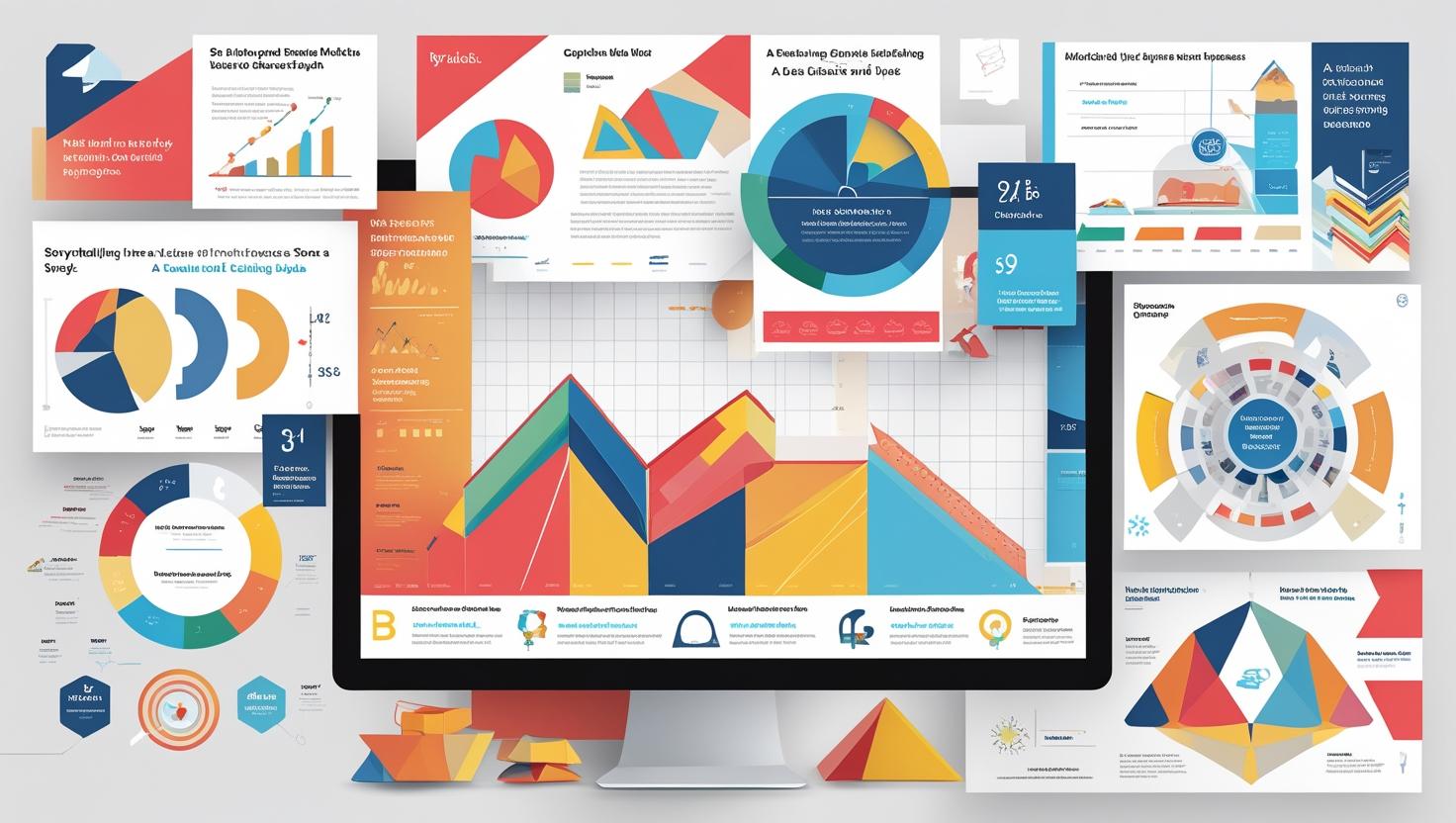
Storytelling with Data A Visual Approach
Learn how to turn data into compelling stories with visuals. Discover techniques to create dashboards and charts that inform, engage, and drive decisions
Introduction
Data alone doesn’t drive decisions—stories do. And the most effective stories in today’s business world are told with visuals.
Storytelling with data is about transforming raw numbers into clear, engaging, and persuasive insights. Whether you’re creating a dashboard or presenting a strategy, visuals help your audience see the point, not just the data.
In this blog, we explore how to use charts, visuals, and design principles to tell impactful data stories.
🔹 Why Storytelling with Data Matters
Without context, data is just noise.
Effective storytelling helps:
- Highlight trends and patterns
- Focus attention on what matters
- Make complex data easier to digest
- Persuade stakeholders and drive action
👉 From Raw Data to Beautiful Dashboards
🔹 Start with a Clear Narrative
Ask yourself:
- What’s the key insight?
- Who is the audience?
- What action should they take?
Your dashboard or report should answer a business question, not just show charts.
📌 Example: Instead of showing monthly sales, tell the story of why sales dipped in Q2 and what can be done.
🔹 Choose Visuals That Match the Message
Each chart tells a different story.
| Chart Type | Best For |
|---|---|
| Line Chart | Trends over time |
| Bar Chart | Comparisons |
| Pie Chart | Proportions (limited use) |
| Scatter Plot | Relationships between variables |
| Heat Map | Patterns or intensities |
👉 How to Choose the Right Chart for Your Data
📌 Tip: Don’t overload with flashy visuals. Simplicity wins.
🔹 Use Design Principles to Guide the Eye
Visual storytelling is also about clarity and focus.
Best practices:
- Highlight key numbers with colors or callouts
- Use white space to reduce clutter
- Limit colors to 3–4
- Align elements for clean layout
Power BI and Tableau offer features like bookmarks, slicers, and dynamic text to enhance narrative flow.
🔹 Support the Story with Context
Don’t assume the viewer knows the data.
Add:
- Labels, annotations, or tooltips
- A clear title that answers “so what?”
- Filters or navigation for interactivity
📌 Example: Instead of “Q3 Revenue,” try “Q3 Revenue Dropped 12%—Driven by Product C Decline”
🔹 Tell, Show, and Recommend
Great data storytelling follows this structure:
- Tell – What are we looking at?
- Show – Use visuals to back the insight
- Recommend – Suggest next steps or action items
📊 Example: “Customer churn has increased by 8% → Mainly in Tier 2 cities → Recommend loyalty campaign or support overhaul”
✅ Conclusion
Storytelling with data is a superpower.
It bridges the gap between insight and impact, turning complex analysis into business action.
When you combine clean visuals, clear narratives, and thoughtful design—you help people not just see the data, but believe the story it tells.
✅ Learn to Tell Data Stories Like a Pro
At Data Analytics Edge by Nikhil Analytics, we help you master data storytelling with:
- Hands-on training in Power BI, Tableau & Excel
- Real-world business case projects
- Visualization best practices and dashboard design
- Short courses for professionals & managers
Tag:Career, Courses, Data, Data Analytics, Data Science
You may also like

Real-World Applications of Business Analytics

Must-Read Books for Aspiring Analysts
